Our Wedding Invitations


Our invitation suites! I am so, so pleased with how these turned out after all the hours of sketching and emailing back and forth with Emily. If she had a limit on revisions, I surpassed them for sure! Just wanted everything to be perfect- and they are. After a lot of research on foil letterpress and second guessing exactly what style I wanted for the official invitations, I went with Emily at Feathered Heart Prints again to close out our stationary the way we started- custom watercolor!
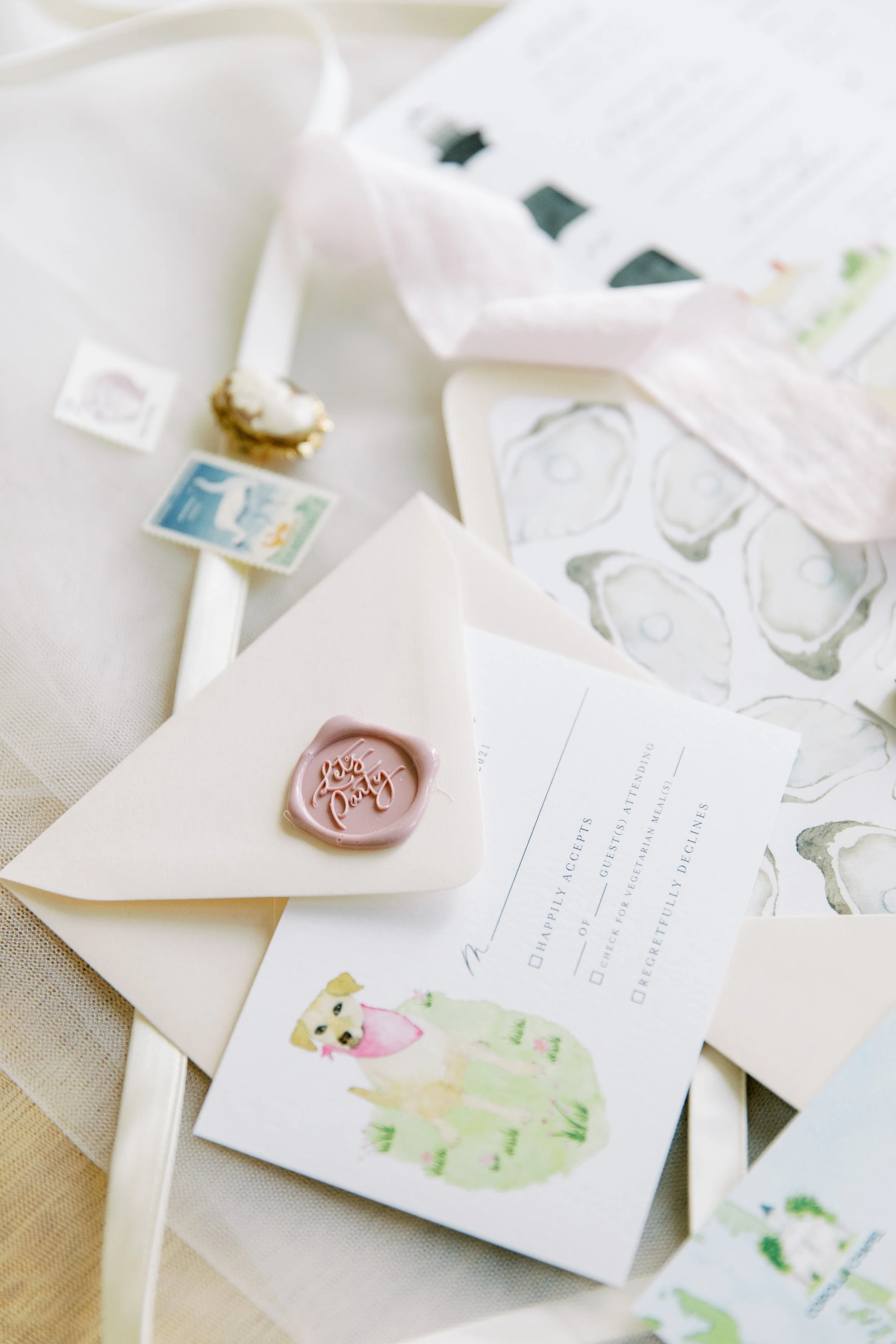
From the beginning I knew I wanted a “cover” painting as part of our suite. I don’t even know where I saw that at first but it clearly stuck with me! We came up with the sweetest painting of Drew, Millie & I standing on the beach. It was a great way to incorporate some pink without making it an overwhelming color in the invites since, you know, these are also Drew’s! That painting went on the top of the suite, then the suite was tied with light pink silk ribbon- another touch I knew I wanted!
From there down we had the RSVP cards & envelopes, which had Millie on them (!!!), then the rehearsal dinner invitation which we designed with an oyster shell pattern- I LOVED these! Under those we put the “Details” card with all the addresses and dress code information, designed with the Bodie Island Lighthouse, a popular lighthouse on the island known for it’s bold stripes. FINALLY, under allll that we had the formal invitation- a painting of the wedding chapel.
The envelopes were a project in themselves! SO MANY STAMPS and they all had to be hand glue! I love the look we got with the stamps and would do it the same 100x over, but wow it was tedious haha. I got most of the stamps from vintage stamp sellers on Etsy. It wasn’t easy making sure they all looked good together, so instead of going by color I went by theme. All of the stamps are connected to the Outer Banks, making them even more personalized to our suite!
Hope you love them like we do!
LOVE,
Jaime